Breakdown
How Notion's landing page actually converts (a breakdown)
An annotated teardown of Notion's homepage. Every section, what it's doing psychologically, what's smart, what's just convention, and what to steal.
Notion sells a product that’s hard to describe, to an audience that mostly didn’t know they wanted it, against a category that didn’t really exist when they launched. Their homepage has been quietly doing the heavy lifting of explaining the product, qualifying the buyer, and converting visitors for years. It’s not the prettiest landing page on the web. It is one of the smartest.
I’ve been pulling it apart for the better part of a week.
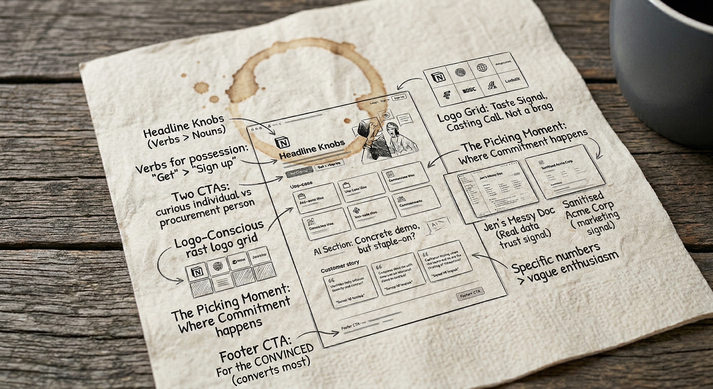
Open notion.com on a second screen and follow along — I’m not embedding screenshots because they update the homepage often enough that any image would go stale, and looking at the live page is how you should be reading any landing-page breakdown anyway.
What you see in the first 600 pixels
The hero is doing five jobs at once and most people only notice one of them.
The headline at the time of writing is some variation of “The AI workspace that works for you.” It’s been through about four revisions in the last eighteen months, which by itself tells you something — Notion treats the headline as a knob, not a monument. The current version is doing the heavy lifting of three positioning shifts at once: “AI” (because they have to), “workspace” (their core category), and “works for you” (the personalisation hook).
Underneath: a sub-line that’s about twelve words long. It expands the headline without repeating it. It also does the unsexy job of telling a skeptical visitor who Notion is for — usually some variant of “write, plan, organise, play.” Notice the verbs. They’re not nouns. Nouns (“the all-in-one workspace”) describe a product. Verbs describe what you’re going to do with it. People convert on verbs.
The CTA is a single black button that says “Get Notion free.” Two things to notice. First: “Get,” not “Try” or “Sign up.” “Get” is a possession verb — when you click it, you have a thing. “Sign up” puts the work on you. “Get” is what the visitor wants to do. Second: “free” is doing all the heavy lifting of the risk reduction. There’s no “no credit card required,” no “cancel anytime,” no “14-day trial.” Just “free.” The shorter the friction copy, the more confidence it implies.
To the right of the CTA: “Request a demo.” This is what 90% of homepages do badly. The second CTA is for the reader who has a different job and a different buying motion. “Get free” is for the curious individual. “Request a demo” is for the procurement person at a 200-person company. Notion doesn’t try to convert them with the same button. Most B2B sites do, and lose both.
Above the fold there’s also a small grid of company logos. I want to talk about logo grids in a second, because this one is doing something subtle.
The logo grid that isn’t trying to impress you
Most logo grids on landing pages are trying to do social proof. The implied claim is: “Look how many huge companies use us, you should too.” Notion’s logo grid is doing something different. It’s telling you what kind of company uses Notion.
If you scan the logos, you’ll notice they skew toward design-conscious tech and creative companies — the kind of brands a marketer or product person at a similar company will recognise as “people like me.” There are some giants in there, but not as many as you’d expect from a company at Notion’s scale. They could put Apple, Microsoft, and the entire S&P 500 in that grid if they wanted. They don’t. They put the brands that signal taste.
This move is subtle, and worth stealing. A logo grid is a casting call, not a brag. The companies you put in it tell the visitor what tribe they’re joining when they sign up. If you put “Fortune 500” logos on a tool aimed at scrappy startups, you’re telling the scrappy startups they’re not the audience.
A logo grid is a casting call, not a brag. The companies you put in it tell the visitor what tribe they’re joining.
The “use case” bento
Scroll a screen and you hit a section that looks like a bento grid — a few tiles, each one representing a use case. “Docs.” “Wiki.” “Projects.” “Calendar.” “Forms.” Each tile has a small product screenshot.
The pattern is doing two things. First, it’s defining the category by listing it. Notion sells a workspace, but “workspace” is meaningless until you tell the visitor what’s in it. Listing the use cases is how they get from “I don’t know what this is” to “oh, it’s a Doc thing and a wiki thing and a project tool.” Second, the bento gives the visitor a picking moment. They look at the grid and silently choose the use case that matches what they came for. Forms? Click. Wiki? Click. Once they’ve picked, they’re committed to the path — the page below scrolls into a deeper version of that exact use case.
This is the part most landing pages get wrong. They try to describe what they do in a paragraph. Notion makes you choose one of six things they do, and then they show you that one thing in detail. The picking moment is the conversion moment. The free trial click ten screens down is just confirmation.
If you build a multi-use-case product and you don’t have a picker like this somewhere on the homepage, you’re forcing the visitor to assemble their own use case. Most won’t.
The product screenshots are doing more than they look
A lot of landing pages have product screenshots. Most of them look like marketing screenshots — staged data, fake customers, “Acme Corp Q3 Roadmap” everywhere. Notion’s screenshots look like real Notion pages, because they basically are. The data is realistic, the hierarchy is messy in places, and the icons are the actual icons users pick.
This matters more than it sounds. When a visitor sees a screenshot they think looks “real,” their brain tells them “I could see myself using this.” When they see a screenshot that looks staged, their brain tells them “this is marketing, the real thing will be different and probably worse.” Realism in product screenshots is a trust signal that almost no marketing team takes seriously.
I’d guess Notion’s design team fights every quarter to keep the screenshots real and gets pushed back on by people who want them cleaner. They should keep fighting.
If you’ve ever seen a marketing-team mockup of a product page next to the actual product page, you already know the difference. The mockup has clean Acme Corp data; the real one has someone called Jen running a quarterly planning template with three emoji and a typo. Notion’s screenshots are deliberately closer to the second one.
The AI section, which had to exist and almost ruins everything
Halfway down the page there’s an AI section. It exists because every SaaS company on earth had to bolt an AI section onto their homepage in 2024–25 or risk looking like they were behind. Notion’s is one of the better ones, but it’s also where the page starts to feel a little obligatory.
What’s good about it: the demo is concrete. It shows Notion AI doing a specific thing — summarise a long doc, generate a meeting brief — rather than gesturing at “AI features.” Concrete demos are always better than abstract ones, and Notion’s are unusually specific.
What’s worse: the section interrupts the use-case flow from the bento above. You go from “here are six things you can do with Notion” to “here’s our AI.” It’s a tonal shift that makes the page feel like two pages stitched together. A bolder version of Notion would either fold AI into the use cases (“AI-powered docs,” “AI-powered wikis”) or put it at the bottom as a feature, not a category. They probably can’t right now because the AI section has to be visible to investors. Marketing decisions are not always made by marketers.
If your homepage has a section that feels stapled on, ask who it’s actually for. (For the same point about voice rather than layout, the brand voice piece is the companion to this one.) If the answer isn’t “the visitor I’m trying to convert,” it’s worth fighting.
The customer stories are the conversion engine
Below the AI section there are customer story tiles — little snippets from companies that use Notion, with a quote, a logo, and a “read story” link. This is where the page does the heaviest conversion lifting and almost nobody notices, because customer stories look boring.
Two things to notice.
First, the quotes are specific. They’re not “Notion changed the way our team works.” They’re things like “we moved from four tools to one and saved [N] hours a week.” Specific numbers in a customer quote are worth ten generic enthusiasm quotes. The visitor’s brain is constantly checking “is this real?” and a number is the cheapest way to answer.
Second, the stories link out to full case studies, but the case studies aren’t the goal. The goal is for the visitor to not click — to read the quote, accept it as evidence, and keep scrolling toward the CTA. The story link is there for the small minority of buyers (usually procurement) who need to verify. For everyone else, the snippet is the proof.
Most landing pages either have no customer proof or they have a wall of testimonials that nobody reads. Notion’s compromise is exactly right: a small number of stories, each one short, each one specific, each one a click away if you need more.
The footer CTA is the one that converts
There’s a final CTA strip at the bottom of the page, after the customer stories and before the footer. It’s almost a copy of the hero CTA but with one small change: it usually has a slightly more specific framing. Something like “Start writing in Notion” rather than “Get Notion free.” The button is the same colour, the same shape, the same wording.
This is the CTA that converts most of the visitors who actually convert, because by the time someone has scrolled past five sections of the page, they’re not browsing — they’re deciding. The hero CTA gets clicked by the people who knew before they arrived. The footer CTA gets clicked by everyone else.
If you only A/B test one CTA on your homepage, test the footer one, not the hero. The hero is for the converted; the footer is for the convinced.
What to steal
If you’re building or rewriting a homepage, here’s what’s worth taking from Notion’s:
- Verbs in the headline. Tell the visitor what they’re going to do, not what your product is.
- Two CTAs for two buying motions. Self-serve and demo. Different colours, different wording, different audiences.
- A logo grid that’s a casting call. Pick the brands that tell the visitor who they’d be joining.
- A picker section. If your product has more than one use case, give the visitor a way to pick the one that matters to them on the homepage. Don’t make them assemble it.
- Real screenshots. Resist the design team’s pull toward sanitised mockups.
- Specific customer quotes with numbers. A specific quote beats five vague ones.
- A second CTA at the bottom. This is where the convinced visitors actually click.
What not to steal: the AI section. Not because AI is bad, but because if you bolt a section onto your homepage just because the category is hot, the visitor can feel it. Either earn the section or skip it.
If you want a similar piece in a different shape, I reverse-engineered how 10 SaaS companies do content marketing is the same exercise applied to blogs instead of homepages. If you’d rather read something that disagrees with the conventional wisdom on testing landing page copy, stop A/B testing your button colours is the piece that goes with this one.
The Notion homepage isn’t perfect. It’s got a few seams. But it does the hardest job in B2B marketing — making a hard-to-explain product feel obvious in eight seconds — better than almost any other page I can think of. That’s worth studying for anyone who has to write one.