Opinion
Stop A/B testing your button colours
Most small-scale A/B testing is statistical theatre. If you don't have the traffic, you're not learning anything — you're cosplaying optimisation. Here's what to do instead.
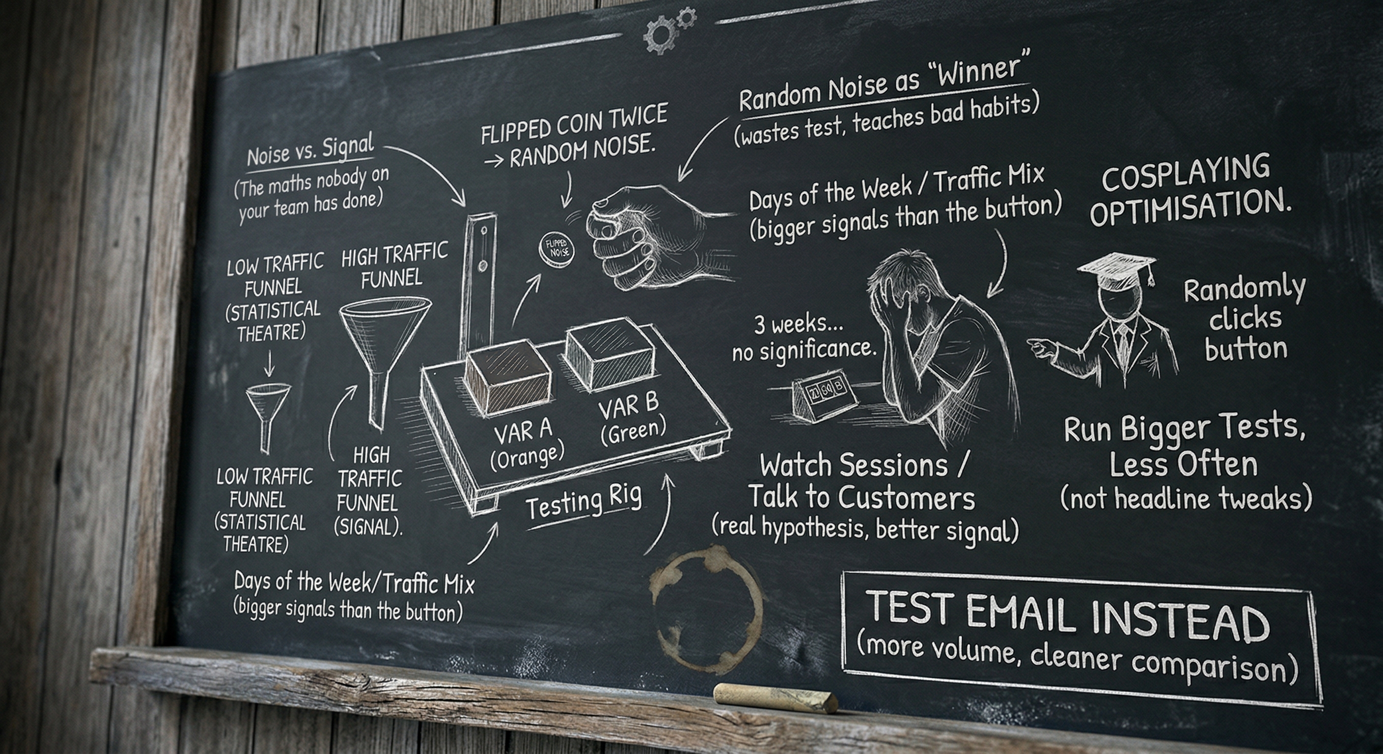
If you have a homepage that gets 800 visitors a week and you are A/B testing the colour of your call-to-action button, I would like you to stop. Not because optimisation is bad. Because what you are doing is not optimisation.
It is statistical theatre. It looks like the work and it produces a thing that looks like a result, and at the end you tell yourself you’ve made the page better when in fact you’ve flipped a coin twice and called the side that came up heads “the winner.”
I’m being dramatic on purpose. The point still stands.
The maths nobody on your team has done
To get a statistically significant result on a typical conversion rate test — say, you’re trying to detect whether you’ve moved from a 3% conversion rate to 3.6%, which is a 20% relative lift, which is the size of “good” experiments — you need somewhere in the region of 16,000 visitors per variant. That’s not a number I made up. You can plug it into Optimizely’s sample size calculator right now and watch it tell you the same thing.
If your page gets 800 visitors a week, you’re going to need ten weeks to run that test. Ten weeks is two and a half months. In two and a half months your business will have changed in twenty other ways. Your traffic mix will have shifted because of a Google update. You’ll have launched a new feature. The season will have changed. By the time the test reaches significance, the result you’re measuring is no longer a measurement of the button — it’s a measurement of all the noise that crept in over ten weeks, with a tiny signal from the button buried inside it.
And that’s for a 20% lift. If you’re testing button colours — and I cannot say this strongly enough — you are not going to get a 20% lift from a button colour. You are going to get, at best, a 1–3% relative improvement, which means you’d need hundreds of thousands of visitors per variant to detect it. Which you do not have.
So what actually happens? You “win” the test after three weeks because the orange button got 47 conversions and the green one got 39. You declare orange the winner. You tell the client. Everyone feels good. The “result” was random noise.
Calling random noise a “winner” doesn’t just waste the test. It teaches your team to trust noise as if it were signal, and that’s a much more expensive habit.
What you’re actually testing when you don’t have the traffic
When you don’t have the volume, you are not testing the button. You are testing four things stacked on top of each other:
- The day of the week.
- The week of the year.
- The traffic source mix.
- The button.
The first three are bigger than the fourth, and you have no way to control for them at small scale. You cannot un-mix a Tuesday from a Monday in your data. Your test result is mostly a measurement of which variant got luckier with the days it happened to run on.
This is why two consecutive A/B tests on small sites so often contradict each other. Not because the results are “fragile.” Because they were always noise. The first test “found” that orange beats green. The second test, run a month later, “finds” the opposite. Neither finding was real.
What to do instead
When you don’t have the traffic for proper testing, you have to make decisions based on judgment, copy, and qualitative evidence. That is not as exciting as a colourful dashboard. It is much more useful.
One. Run bigger tests, less often. If you’re going to test, test something that could plausibly produce a 30%+ lift. Not button colour. Not headline tweaks. The whole hero section. The pricing page layout. The form length. The placement of the primary CTA. Bigger tests need fewer visitors to detect, because the effect size is bigger relative to the noise.
Two. Test things you have a real hypothesis about. A real hypothesis sounds like: “The pricing page is losing visitors at the plan comparison table because the table is hard to scan on mobile. If I redesign the table for mobile, more visitors will reach the checkout button.” It does not sound like: “I wonder if green works better than orange.”
Three. Watch sessions, not stats. Tools like Hotjar or Microsoft Clarity give you actual session recordings. Watch ten of them. You will learn more in twenty minutes than in two months of A/B testing. You will see exactly where people get stuck, what they hover on, where they bail. Almost every insight I’ve had about a small site has come from watching sessions, not running tests.
Four. Talk to five customers. Genuinely. Schedule a call. Ask them why they bought, what they almost didn’t, and what nearly stopped them. The pattern across five conversations is a better signal than 5,000 visitors clicking buttons.
Five. Ship and decide. When you have to choose between two designs and you don’t have the data to decide, make the better one — the one with the clearer hierarchy, the simpler CTA, the more honest headline — and ship it. “Better” by a marketing person’s judgment is not the same as “winning a test,” but at small scale it’s almost always the right call. You’re not optimising a multi-million-dollar funnel. You’re trying to make the page good. Making it good is allowed.
What I’d actually run a button test on
Honestly? I’d test buttons on email, not on a low-traffic homepage. Email gives you bigger volume per send for transactional moments, faster cycles, and a much cleaner audience comparison. Even a small list (5,000 subscribers) can give you a meaningful test on an email subject line in 24 hours, where the same number of weekly homepage visitors would take a quarter to produce a result.
If you really want to test on the website, test the pricing page — the highest-intent page, which usually has the highest conversion rate and the smallest volume requirement to detect a meaningful lift. Don’t test the homepage, which has the lowest intent and the noisiest traffic.
The point
A/B testing at small scale isn’t evil. It’s a hammer being used on a screw. The reason it gets used so much is that it makes a marketing team feel scientific without requiring them to make hard judgment calls. It is, in many cases, a way of laundering an opinion through a statistics-shaped funnel until it comes out the other side looking like data.
If you don’t have the traffic, you don’t have the right tool. Use a different one. Watch sessions. Talk to customers. Ship the version that’s clearly better. Save the testing for when you’ve got the audience to make it real — and when you do, test the whole hero, not the button.
If you want a related piece in a different shape, why your “brand voice guidelines” aren’t working is another piece arguing that something everybody does isn’t working the way they think it is. And if you want to read about what the work does look like when you stop optimising the wrong things, what running SEO for a small business actually looks like is the longer answer.
Stop testing button colours. The button isn’t the problem.